Branding: What does it mean?
“Branding” describes the process of searing a distinct mark into the hide of a cow or other livestock using a branding iron.
It also means the promotion of your product or company with advertising and distinctive logos.
Today, we’ll be talking mostly about the latter definition. But before we press your sizzling new brand up to the tender flesh of your company, let’s go over exactly why you need to focus so much on getting it right.
The Importance of Branding
Chances are, there are a ton of people out there doing or selling exactly what you are. Your brand is what sets you apart from the others. It’s a way of saying, “Sure, you could buy the same thing from someone else, but this is how our company is different.”
And, even more importantly, your brand is your company’s identity. When customers see your logo, font, color scheme, and graphics, they should get an idea of what your company stands for and how their experience with you will be.
The Stats
You don’t have to take our word for it. Here are some statistics that prove the importance of having your own consistent brand identity:
- 88% of consumers claim it takes three or more purchases to build brand loyalty
- 23% is how much you can increase revenue by improving consistency in your brand.
- 94% of consumers say they choose brands they feel emotionally connected to
If you’re wondering how to improve loyalty, consistency, and emotional connection for your brand, buckle up – you’ve come to the right place.
Design and Voice
You have ten seconds for your customer to memorize your logo and associate it with your brand. How can you tell them so much in just ten seconds?
Well, you could try describing your brand with words, like this:
But that’s kind of long. You only have ten seconds, so something like this:
…will do the job faster.
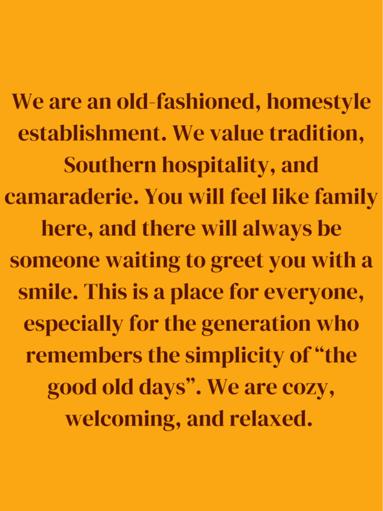
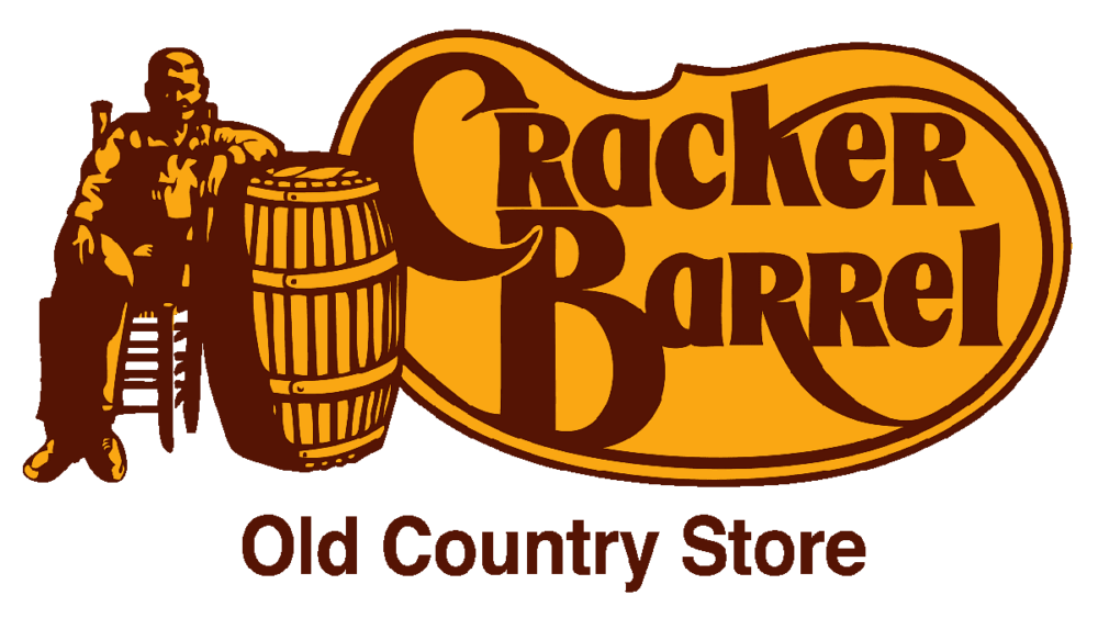
Whoever created the Cracker Barrel logo made design choices that speak to what the restaurant represents: Hand lettering in a serif font brings us back to the days before computer printing. The gold and brown (Cracker Barrel was founded in the 70’s) radiates coziness and warmth. A smiling grandfatherly man leans against a barrel – he’s wearing overalls, so don’t worry about dressing up for this establishment. Just get ready for some good country cookin’ surrounded by old rusty farming equipment and vintage signs for cough syrup.
A picture really is worth a thousand words.
3 Key Elements to Help You Build Your Brand Strategy
You’ve seen a small amount of inspiration from great brands – how about your own? Let’s develop a brand strategy.
To start, grab a whiteboard and flesh out these key elements of your brand’s identity:
- Your Core Message is a clear statement to why you started this business in the first place. Who are you trying to help? How, and why?
- Your Core Audience is a specific, narrowly defined audience. Yes, your product might be “for everyone”, but who is most likely to buy it? Cracker Barrel’s target audience is the older generation, as you can tell from the logo. They aren’t wasting any money trying to appeal to edgy teenagers. Meanwhile, Hot Topic’s target audience is edgy teenagers, and they aren’t wasting any money trying to get your grandma to shop there.
- Consistent Brand Messaging is the big moneymaker. Once you nail down what your official Purpose Statement is and create your new visuals, it’s up to you to keep that identity consistent in every decision you make. This of course means keeping your logo, colors, font, and other design elements consistent across all your marketing channels.
…but it also means keeping your values consistent.
Starbucks is a great example of this. Their official purpose is this:
“To inspire and nurture the human spirit – one person, one cup and one neighborhood at a time.”
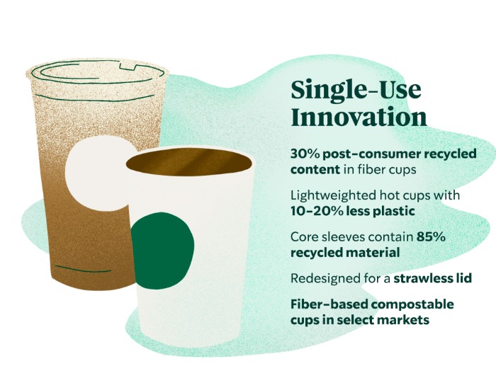
….And it works, because they held themselves to it. Over the years, you’ve probably noticed how Starbucks has switched to more ethically-sourced coffee, less plastic packaging, hosted community-specific events, and emphasized their charitable donations. All of these actions prove their money is where their collective mouth is, and customers can trust what they say.
Brand Evolution
“Brand evolution” is your brand’s way of showing you’re still kickin’. Your company is active, innovating, and has an eye on the latest trends. By working to improve small aspects of your business, you’re showing customers you’re dedicated to their needs and responsive to feedback.
Product evolution
Let’s say you own a pizza restaurant, and it’s time for some brand evolution. What are some ways you could shake things up (in a good way?)
- More products/services – You already sell pizza, why not sell wings and desserts? T-shirts? Collectible Pogs?
- Better quality products/services – Take a look at your current process and find things to improve. You already deliver the pizza, but how about offering a tracking service for deliveries? Or, to keep up with the “farm to table” trend, let your customers know you’ve officially switched from the Big Brand cheese to hand-pulled, locally-sourced, gluten-free mozzarella.
Logo redesign
When did this go out of style…
…and why was it replaced with this?
In the early 2000’s, the internet was brand new and everyone was super excited about it. Companies wanted to show that they, too, were hip with the ‘net.
This resulted in a lot of 3D elements, accent shadows, and a shiny chrome look (you may see this aesthetic referred to as “Web 2.0”)
Then, all of a sudden, you could get the internet on your phone. Company websites needed to be optimized for mobile, which meant logos needed to adapt to different sizes and scaling.
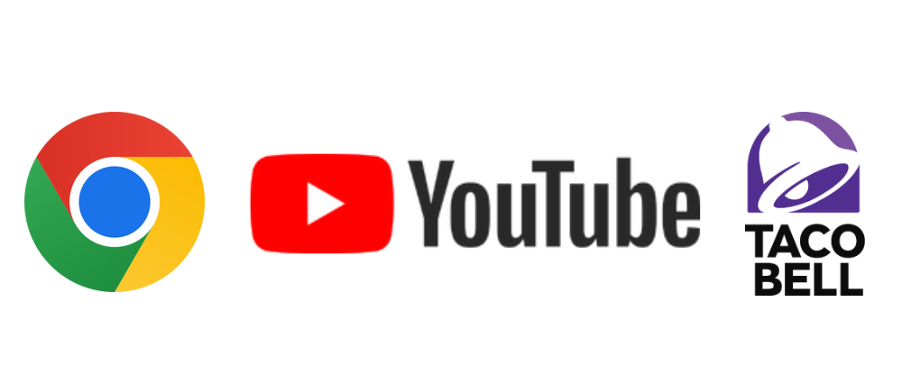
Brands quickly dropped the Web 2.0 aesthetic and opted for the flat, minimalist design. Now, the new logos look good on a desktop, a phone, or blown up on a billboard.
This is an example of brand evolution – by changing your logo to fit new technology, you make your brand more accessible to potential customers.
…keep in mind, however, that not everyone likes change.
Always keep your company’s core values consistent throughout your redesigns, or you’ll lose the very identity that attracted customers in the first place.
One example is the infamous JCPenny logo change of 2010. Following the minimalist trend, JCPenny underwent a redesign that labeled it simply “jcp” instead of its full name.
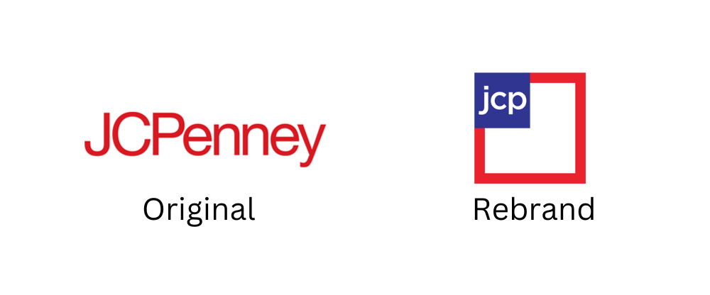
…And afterwards, the brand recognition fell by 28%. They even had to release an apology video with the original logo to get customers to come back. In the dash to keep up with the current styles, JCPenny lost sight of what made their brand recognizable.
Design Tips
Looking for branding inspiration to improve your old logo? Keep these tips in mind:
Color
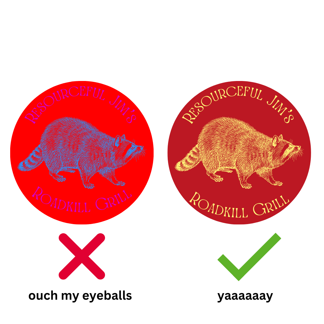
- Avoid lots of saturated colors, which are too bright and intense together.
- If you’re adding text, always use dark-colored font on a light-colored background or light font on a dark background. Anything else is too hard to read.
- Play to psychology – red is an eye-catching color that represents power, energy, and passion. Blue is calming, mature, and trustful. Yellow is cheerful and fun, and can even increase appetite (just look at how many fast food places use it!). Green is perfect for creating a natural, organic feeling, while gray and white are futuristic and clean.
Font
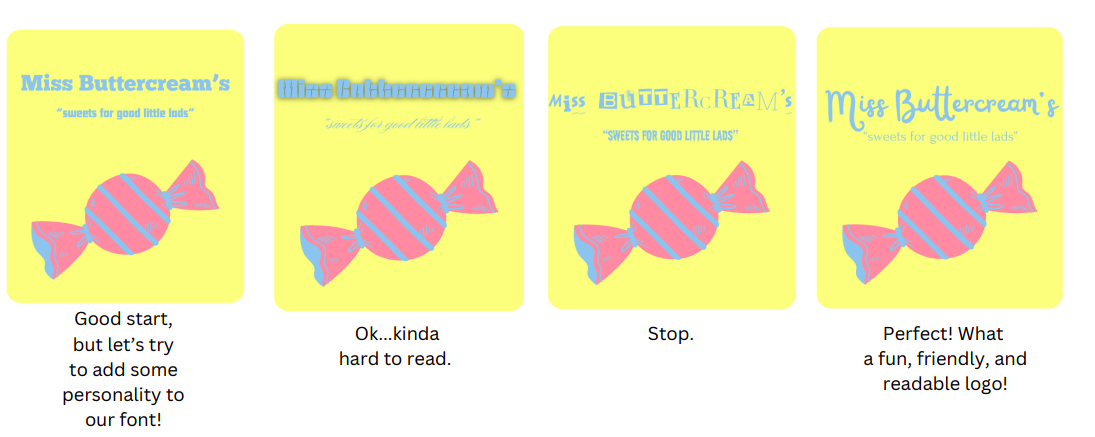
- Clear and neat. If you use cursive, make sure it’s readable. No wingdings.
- Take care in choosing a case. Text in ALL CAPS is powerful, attention-grabbing, and traditional (think newspaper headlines). Text in all lowercase is more laid-back, casual, and futuristic.
- Take care in choosing serif. Serif fonts (fonts with those little “feet” on the end of the letters) are professional, elegant, and authoritative. Sans serif fonts (fonts without the feet) are simplistic, modern, and friendly.
- Your font shows your brand’s personality. There will be multiple fonts that look “good”, but try to dig deeper for the perfect fit.
Don’t forget to keep both color and font consistent across all marketing channels.
…And please, please double-check your font choice before spending money on signs, labels, or office supplies:
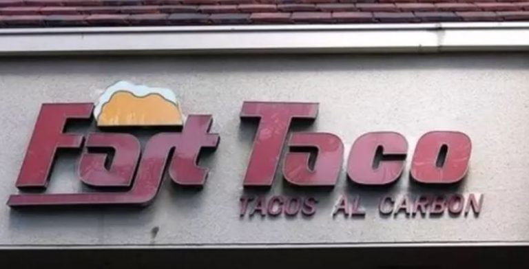
(If you saw “Fast Taco” immediately, pat yourself on the back for being a more mature person than me.)
Rebranding: The Complete Makeover
Maybe you don’t want to take baby steps. Maybe you want a completely new look.
Fun fact: we actually started out as Leverage Creative Group, and our logo looked like this:
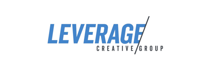
After a few years, we needed a change to better represent how our company’s vision has evolved, so we hired a designer and got to work. “Creative Group” was too vague, so we changed our name to fit exactly what we do: we leverage brands.

To be completely honest, we didn’t have a concrete logo in mind when we decided to revamp. All we knew was that we wanted something less corporate and more relaxed. Our designer showed us the lowercase option, and we knew immediately it was the right choice.
But that’s not all! We…
- Revamped the website to be more user-friendly
- Updated our blog with fresh content in a stronger voice
- Added more services to our menu, including new kinds of contracts to fit the needs of our clients
Plus, we reorganized our meeting schedule, onboarded new employees, and reevaluated our Core Values.
That’s right – not only did we change our logo and name, but we also changed things internally.
People think a “rebrand” means slapping a fancy new logo on the same old company (that would actually be an example of brand evolution). A true rebrand is a complete reanalysis of your brand from the inside out – including the parts the customer doesn’t see.
Branding Inspiration: Ten brands that got it right, and two brands that…well…
1. Geico
What they did right: Personality. The lizard. Of course it’s the lizard. Car insurance is a serious, and, quite frankly, boring topic. Having an animated gecko in funny, non-insurance-related situations helps customers put a friendly face to the brand name.

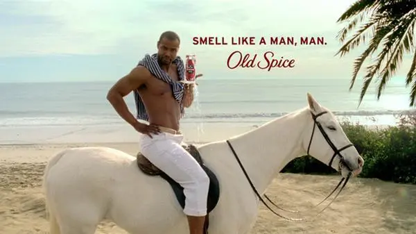
2. Old Spice
What they did right: Switched their audience. A long time ago, Old Spice deodorant had a reputation as “the geezer deodorant”. If you were using it, you were probably a grandpa. A clever, hip ad campaign later, and you can’t walk into a highschool locker room without getting suffocated by the fine mist of the stuff.
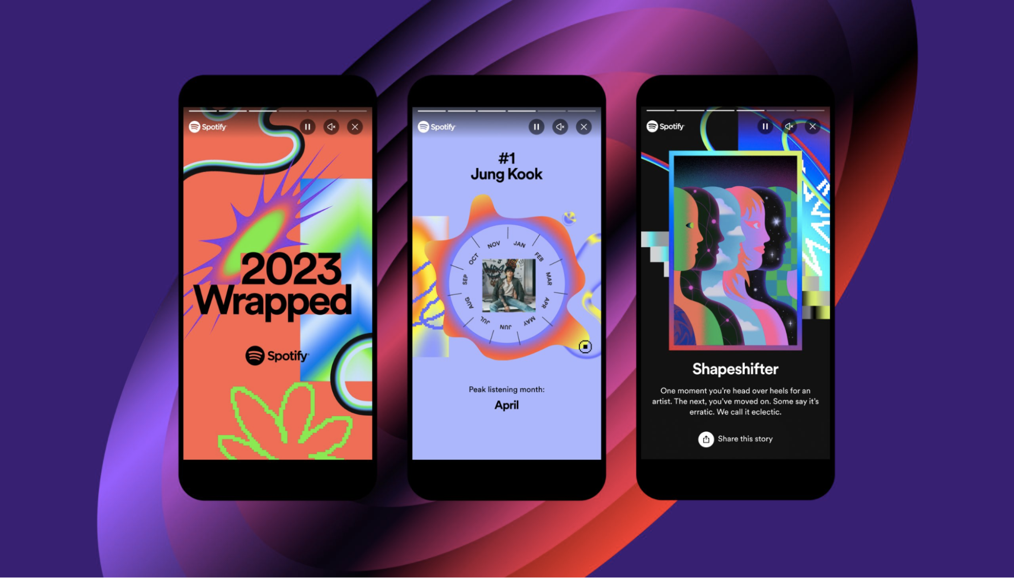
3. Spotify
What they did right: Evolved customized content. Spotify pioneered their “Spotify Wrapped” at the perfect time. In a world charged by social media and individualism, they came up with something user-specific, shareable, and uniquely theirs.
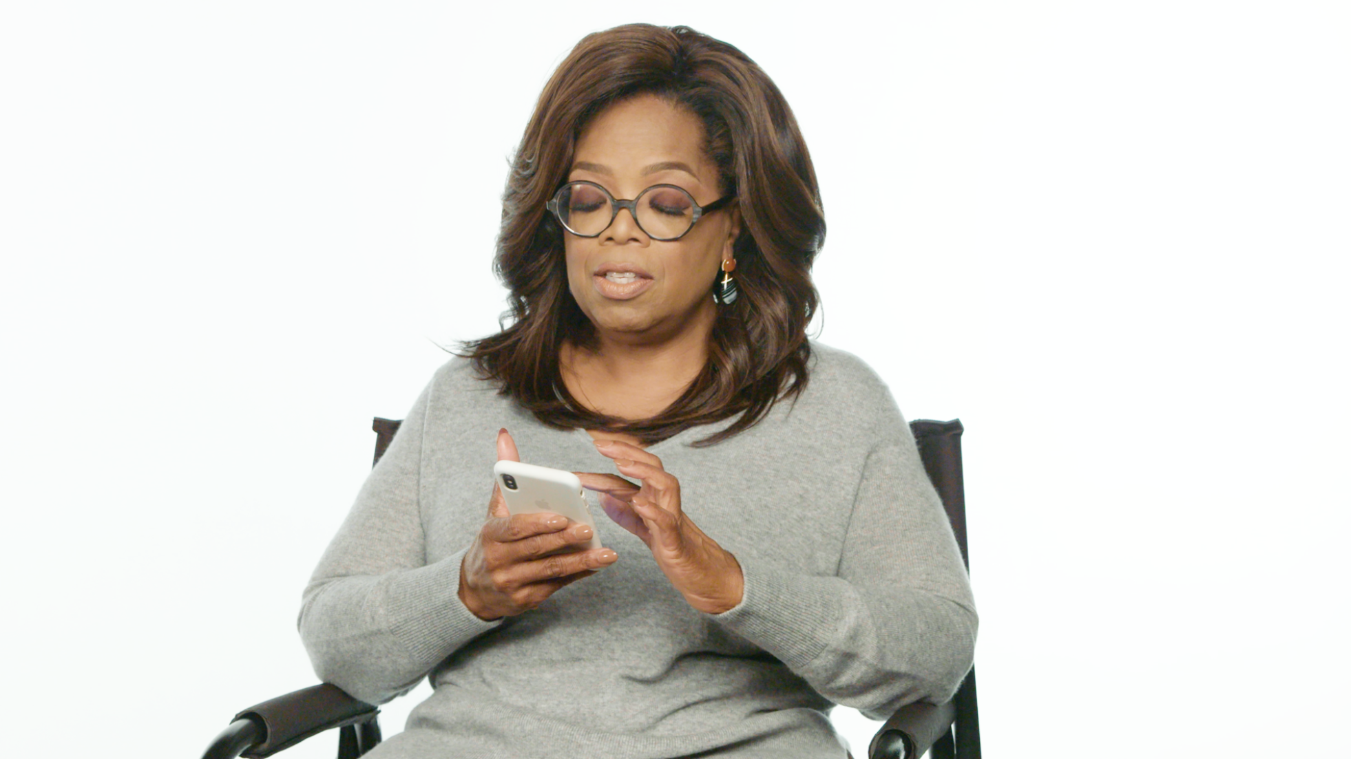
4. Oprah
What she did right: Emphasized her core values. Oprah’s mission was to be a teacher and beacon of inspiration, which is hard to do with a worldwide brand. She bridged the distance by surprising lucky students with personal, uplifting comments on their Instagram posts. Because she interacted directly with them, Oprah’s audience saw her as an accessible mentor instead of a faceless corporation.
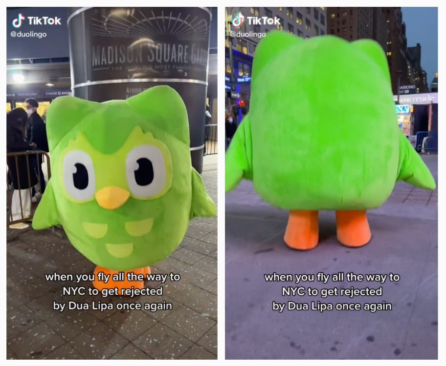
5. Duolingo
What they did right: Choosing a platform. Have you seen the Duolingo Tiktok recently? It’s full of popular dances, challenges, and skits featuring their lovable owl mascot, Duo. Duolingo keeps a close eye on what’s trending with the app’s main user base (teens and young adults) and delivers tons of content to keep up. Now you can’t scroll without running into them.
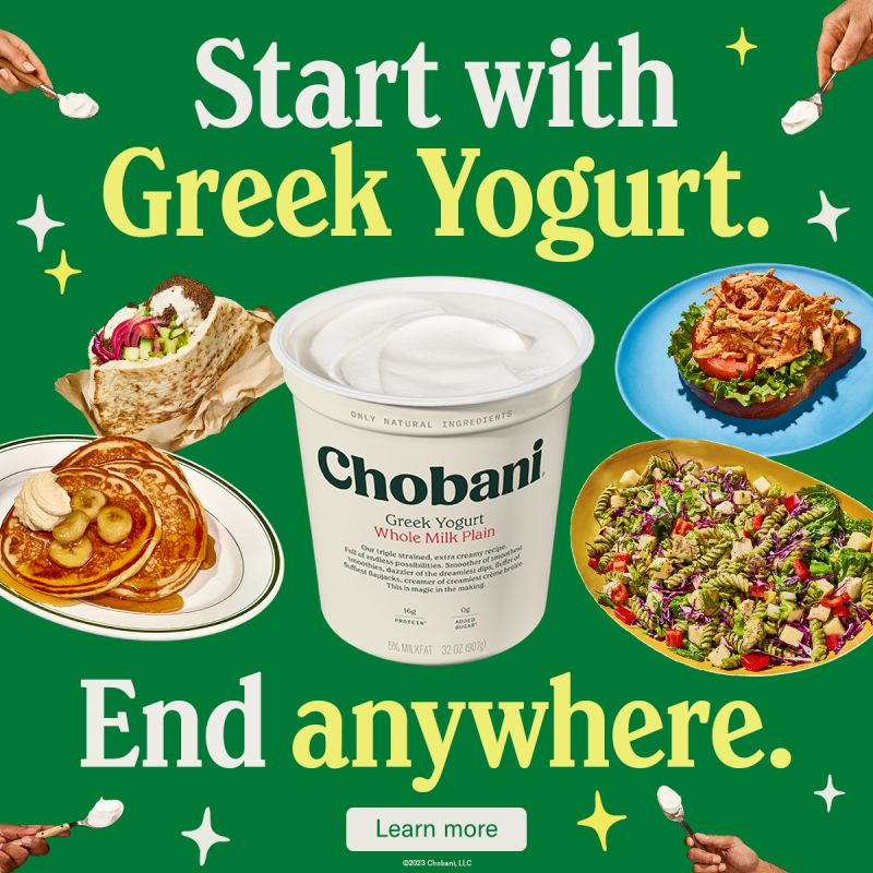
6. Chobani
What they did right: Product awareness. Sometimes your customers don’t know what they want, and you have to show them. Chobani didn’t want to just sell yogurt, they wanted something bigger and more versatile. What came out of this was a clever ad campaign that showed yogurt as a recipe ingredient. Sales went up as customers began to see the brand as a recipe staple instead of just a snack.
7. Dollar Shave Club
What they did right: Being punks. Who was the coolest kid in your 7th grade class? Were they known for following the rules and working quietly? Of course not! People love rulebreakers and backtalkers, which is the persona Dollar Shave Club capitalized on with their in-your-face, playfully unprofessional commercials.
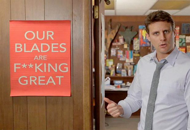
Woah! Is that a SWEAR WORD, young man??
8. LifeAlert
What they did right: Consistency. How many times have you heard “I’ve fallen and I can’t get up!”? A lot, right? That phrase has made it into so many movies, shows, comics, and even daily conversation. By featuring the line in every commercial, LifeAlert ties a story to their product, ensuring customers won’t forget about them.

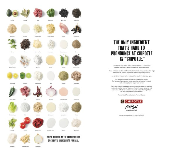
9. Chipotle
What they did right: Positioning. Chipotle knew that there were tons of other TexMex fast food places out there. Instead of copying the masters, they capitalized on what nobody else did: fresher, healthier, better quality ingredients. They’re much more expensive than Taco Bell, but the premium experience is what brings customers back.
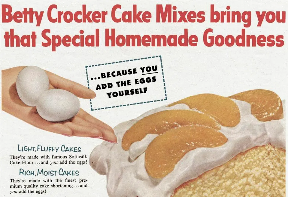
10. Betty Crocker
What she did right: Add egg. No, really. Back in the 50’s, all you needed to add to a box of cake mix was water. All the eggs were powdered and premixed with the rest of the ingredients.
…but Betty Crocker realized that its audience wasn’t buying mixes just for the cake- they were looking for the homemade experience. The company started selling cake mixes that called for water and one egg, and couldn’t keep boxes on the shelves. Sometimes it’s not about the product itself – it’s about the buyer experience.
…and now, a quick look at two brands who didn’t quite hit the mark.
1. Weight Watchers
What they did wrong: Minimalism to a fault. In 2018, Weight Watchers wanted to move away from the weight loss industry and towards general health and wellness. That’s what caused them to settle on this minimalistic logo:
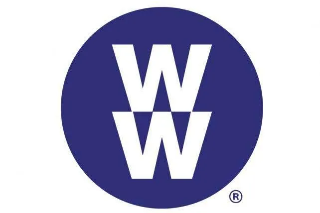
…which, if you’re unfamiliar with Weight Watchers, could stand for literally anything. Both new and returning customers were too confused by the logo to interact with the brand. After all, “WW” could stand for anything – “Wrongful Wrestlers”? “White Whiskers”? “William’s Warthog”?
2. Radio Shack
What they did wrong: Misguided target audience. In an appeal to keep up with the hip young kids, Radio Shack rebranded themselves as “The Shack”, which lost them a great percentage of recognition as an electronics brand. Why did they think this was a good idea? If you’re curious, why not drive down to your local Radio Shack and ask them?
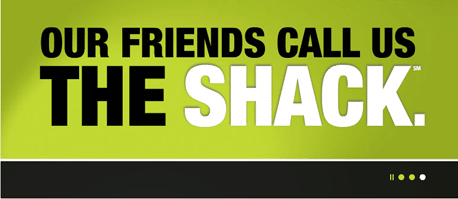
…oh. That’s right. Nevermind.
Parting Words
Yes, branding involves a lot of decisions.
You will make good branding decisions. You will make bad branding decisions. You will learn a lot along the way.
That being said, don’t let stories of bad design choices scare you away from improving your own brand. You got this!
To start, find a brand you particularly like and write a list of pros and cons you see in their brand identity. Take an extra long look at their logo, color, and font choices. How do each of those elements make you feel about the company? Is there anything you would change?
…and of course, you always have our resources to give you that little boost. Good luck!
